Tuesday, 20 September 2011
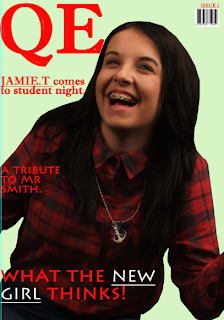
Whilst creating this front cover I took aspects from both the Vogue and Q magazines of which I uploaded onto my blog. Both magazines had bright colours on the front cover. However, Q magazine was too cluttered with sell lines and I don't believe that is appealing to the reader.In addition, I find it much more appropriate to use only the main sell lines so that the reader is interested but doesn't know everything they want to know by just looking at the front cover. Therefore, after looking at the Vogue front cover I thought I would steer in that direction. I've made the mast head the brightest and largest thing on the page so it is the thing that people see first. The house-style is the same so that people can recognise the magazine and want to buy it.
I've kept the same house-style throughout including font, colour and mast head. I will use smaller images on the contents page that relate to the sell lines on the front cover. I've seperated different categories with bright and bold banners so it makes it easier for the reader to find what they're looking for. When writing September issue I made a spelling mistake and when making my real copy I will spell it right.
I've kept the same house-style throughout including font, colour and mast head. I will use smaller images on the contents page that relate to the sell lines on the front cover. I've seperated different categories with bright and bold banners so it makes it easier for the reader to find what they're looking for. When writing September issue I made a spelling mistake and when making my real copy I will spell it right.
Friday, 16 September 2011
Wednesday, 14 September 2011
Although this front cover is a different genre to the Vogue one i do believe the colour and layouts are similar. The background is neutral and the important sell lines are the same colour as the mast head. Additionally, all sell lines including the main one frame liams face, this suggests that he will be the main story within the magazine. I like this aspect to the front cover because it means the reader knows what they're buying. Names of artists are always in bold, this attracts the buyers attention and intices them into buying te product. The clever twist with the photo comes secondry to all of the above, however, once noticed it adds interest and a slight hint of humour to the magazine, this is a great selling point.
This contents page refers back to the front cover, as all of the images used link with the sell lines. The house style has remained the same throughout with the use of the colours black, white and red. Similarily to the Vogue contents the banners are highlighted by a bright colour. The layout is clear and easy to read, with introductry sentences of which make the reader want to turn the page to find out more.
Even just glancing at this front cover you imediately notice the bold colours, this is a good way to get people to notice one magazine before the others on the shelf. Everything that the publisher wants you to notice is bright, bold and a lot lager than anything else on the page. In my opinion the layout is simple, doesn't interfere with the main image. The sell lines frame the image therefore the model becomes a focal point for the reader.
The the brightness if the banners allows the reader to be able to find what they're looking for much more easily. I like how the background of the page is kept neutral so that other aspects of the page become much more prominent. Once again, the simplicity of the layout is much more welcoming to the reader than if it was unnecessarily cluttered. Both images are a powerful even though the colours are kept simple.
The the brightness if the banners allows the reader to be able to find what they're looking for much more easily. I like how the background of the page is kept neutral so that other aspects of the page become much more prominent. Once again, the simplicity of the layout is much more welcoming to the reader than if it was unnecessarily cluttered. Both images are a powerful even though the colours are kept simple.
Tuesday, 13 September 2011
Preliminary Exercise: Using DTP and an image manipulation program produce the front page of a new school magazine, featuring a photograph of a student in medium close-up plus some appropriately laid out text and mast head. Additionally, you must produce a mock up of the layout of the contents page to demonstrate your grasp of DTP.
Main Task: The front page, contents and double page spread of a new music magazine. A minimum of four images. All images and graphics must be produced by the candidate.
Main Task: The front page, contents and double page spread of a new music magazine. A minimum of four images. All images and graphics must be produced by the candidate.
Subscribe to:
Comments (Atom)


